

01
Project Goal
To create memorable and impressionable designs that help people immediately identify and understand the organization while also creating a visual tone that sets Silver State Esports apart from other non-profits.
Hired by Davis Cowles, the Director of a non-profit organization called Silver State Esports.
02
The Process
The project spanned over five years, and so it was a slow and steady process towards fully fledging out the organization’s design. There was a lot of back and forth between the Director and me as I did my best to give my input on where the organizational branding could go while still trying to fulfill aspects of his vision. There were many different iterations of the original logo, but after finally solidifying the brand, I created an official mini-brand guide.
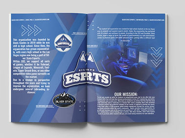
I opted for blue and white/silver variations in the color palette to signify Nevada’s state colors, silver and blue. I thought this would be the best route to pay homage to the name of the organization, “Silver State,” while also showcasing that the organization is Nevada-only. As for the fonts, I decided to go with sans-serif fonts to help the readability of most of our promotional materials while also following the sleekness of most other gaming organizations and materials. I incorporated two design elements, dots and arrows, to help portray the point of the company. The dots referenced digitalization, while the arrows represented the mountains in “Silver State” and the progressiveness that the organization wanted to uphold, which is “always moving forward with the ever-changing times.”
Within the brand guide, I chose to incorporate past and current designs of both promotional flyers and logos so that people who took on the Design Head role after me could understand the organization's origins and use those visuals to propel the company’s design forward.
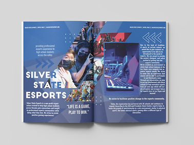
I would go to each event for most Silver State Esports events and take photos. After taking photos, I would pull them into all promotional materials and sort out the best ones to promote the next event. It helped provide personability to the experience of Silver State Esports. Also, it offered excitement for people going to the events, knowing there was a possibility they might get featured in the next post released.


03
Early Stages
This is a close-up of the original design created during the early development of Silver State Esport's brand identity.
04
Project Outcome
The project was highly successful and made the client more than happy. With proper promotional and design materials, the project was a feature in the Las Vegas Sun News, and many local corporations sponsored it. My designs were featured on the big screen in the HyperX Esports Arena in the Luxor.