01
Project Goal
To create a branding identity for the client Gale Dekarios, a charming and powerful fictional wizard from Waterdeep, a Baldur’s Gate 3 region. The logo for this character was inspired by Victorian design, particularly regarding the typographic style and intricate designs they feature. The purpose of this logo is to advertise his name far and wide to the people of Baldur’s Gate while getting a sense of the astronomical (metaphorical and literal) magic he possesses.
02
Sketching
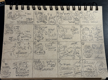
Before starting the project, I went through a brainstorming session to decide what exactly I wanted to name the branding. From the name, I started thinking of different icons and elements I thought would best represent my subject at first glance. I went with “Gale of Waterdeep” and cherry-picked specific ideas from the different branches of brainstorming conducted to go into the sketching process.
During the sketching process, I found it extremely difficult to hone in on the essence of Victorian design until I considered incorporating different kinds of banners into my work. From there, I was able to generate a lot more while staying true to Victorian design. I branched into different layouts that I would’ve never considered initially if not for this project. After sketching, I created five rough drafts based on the original sketches. Some rough drafts combined two or three sketches rather than ironing out one sketch to look cleaner. In doing this, I was able to produce better results.

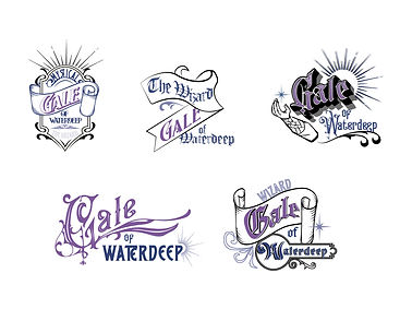
03
Rough Draft Process
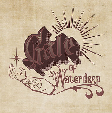
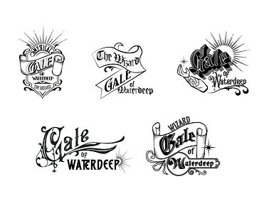
These five rough drafts were products of the original sketching process. I created one iteration in color while the other one was in black and white. Overall, I found the design in the top right to be the most successful and continued to fledge it out from there. I made a few minor adjustments to the design, like placing the arm closer to the decorative element flowing underneath “Waterdeep” to add better continuity. I found that specific design to be the most successful because the radiating lines stemming from “Gale” helped portray the glamorous and astronomical magical power of the subject himself. The circular shape helped reel the logo in to be more cohesive and gave a friendlier, more inviting tone to his magic show. On the bottom portion of the logo, I wanted the decorative element to flow like a wave since the subject originated from a port city. Finally, I chose to include Gale’s arm design, casting a spell next to his name to solidify the idea of his magic show further and give more maximalism to the Victorian concept I was aiming for.
04
Colors/Type
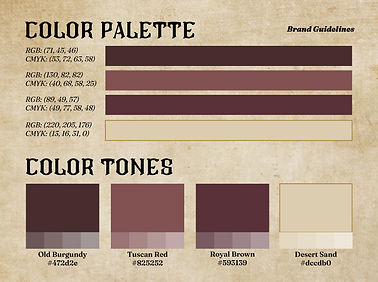
While initially thinking that I would go with a blue and purple color scheme, I later found out that it didn’t really match my vision for “Gale of Waterdeep”. I wanted his branding to have more of a monochrome palette to fit the more illustrative angle I was going for better. I focused on the illustration linework rather than the colors. I matched the color scheme to his brownish garment designs to remain in tune with the subject color-wise. I tested between blacks and browns and felt that the brown tone had a less harsh gaze for the eyes, which helped attest to his friendly demeanor. The harshness of the black would’ve made his branding take on a more serious tone.
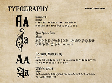
When choosing the typography I wanted for my branding, I focused on utilizing highly decorative fonts to catch viewers’ eyes and semi-decorative fonts for the main bodies of text. I didn’t want to go too simplistic for the body text fonts because many Victorian designs focus more on the artistic, maximalist style rather than the functionality of the design. In choosing my fonts, I ensured that the text was readable while still maintaining the essence of Victorian design.
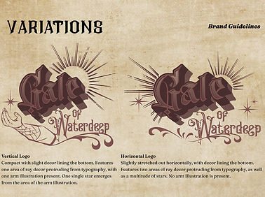
This image shows the final logo utilized for all aspects of the branding. I adjusted the colors to match the new color scheme I put in place and, as previously stated, adjusted certain aspects of the arm to be more consistent with the rest of the logo. Based on the original design, I also created a horizontal version to better fit into the horizontal landscape of some of my advertisement designs. By having variations, I could more cohesively put my advertisement and building signage together.


05
Advertisements/Signage
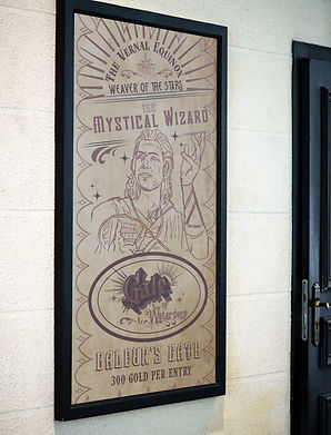
For my advertisements, I struggled the most with long layouts like the postcard and mobile ads. It was tough to figure out a way to incorporate my logos while promoting the show itself since the logo, at a baseline, was already very busy. Because most of my typical designs are more modern, I sometimes slipped into old layout ideas and strayed away from the Victorian theme. After acknowledging the awkward setup of the original logo on my advertisements, I revised the long layout designs to instead feature my horizontal logo variation. I found that it worked better. To fill in negative space, I created additional decorative elements that would help the mystical, magical concept of Gale’s magic show. I also brainstormed short phrases to catch viewers’ attention and included some in my longer designs.
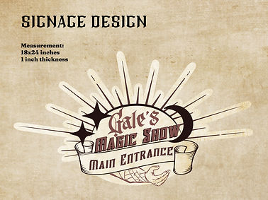
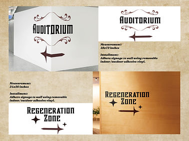
For my signage designs, I only took certain aspects of the logo and used those elements to apply them to the directional signs. The main entrance featured a rendition of my logo to keep it identifiable as the same branding, and the additional signage included the flowing decorative and star symbols and remained similar to the majority of my branding.

06
Project Outcome
The project successfully adopted the Victorian-era style. I was proud since I’d never really done a maximalist design before with heavily decorated fonts throughout the work. Finding a good balance between function and design was a challenge, and I believe that it came out the way I’d hoped. I also experimented heavily with different effects I wouldn’t usually use in Adobe Photoshop and Adobe Illustrator.